
The Creative Studio updated Netflix’s former brand ident animation in order to better reflect the changes that have been happening at the company. Some things we wanted to keep (for instance, the catchy audio mnemonic and the now iconic N symbol). But we needed a brand system that represented Netflix’s global presence and breadth of original content.
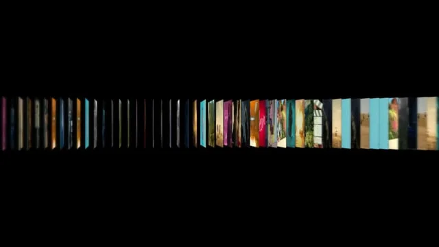
We decided to show that the N symbol was made up of a spectrum of colors, inspired by the spectrum of stories, emotions, languages, fans and creators that collectively make up who we are as a brand.
We also changed the background color from white to something much darker and more cinematic, in essence, going from an interruption to an invitation into our content.
The final challenge was to show that the visual system could flex across product and marketing. The video at the bottom was used internally to launch the new ident and demonstrate how the brand would evolve.